Webflow
- Designer webflow UI tutorial
- Adding elements in Webflow
- Auto margin in Webflow
- Breakpoints Shortcuts in Webflow
- Client's guide to the Editor: Collections tab
- Dashboard in Webflow
- Element Hierarchy
Designer webflow UI tutorial
The Designer is the heart of Webflow's visual web design platform, the canvas
on which you'll design and develop beautiful, responsive websites.
Webflow can be divided in to 3 part:
1. Left Toolbar contains
- Elements Panel
- Symbol Manager
- Navigator
- Pages Panel
- CMS Collection
- E-Commerce Section
- Asset Manager
- Settings
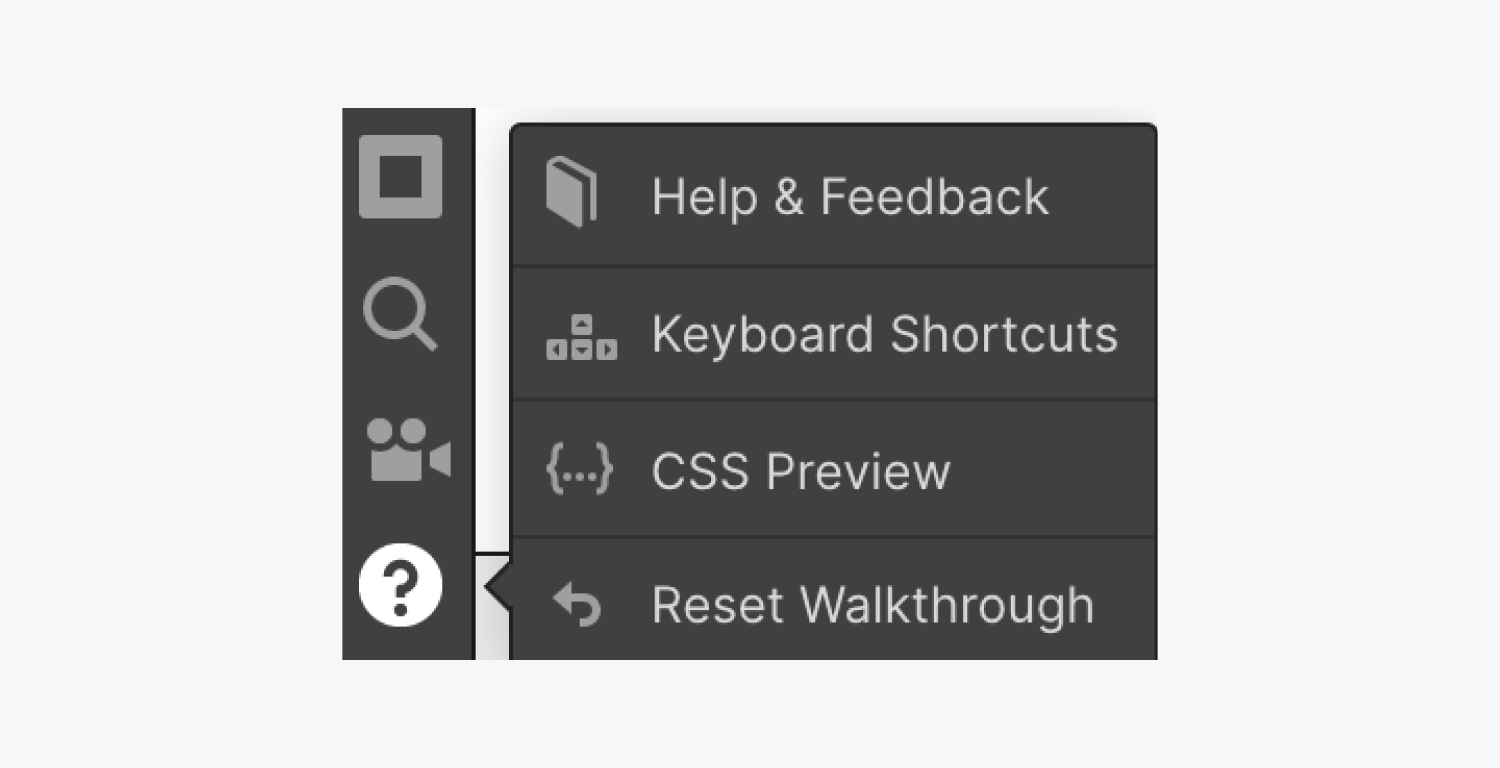
Help Section in Left Toolbar contains
- Audits
- Search
- Video Tutorial
- Help Section
2. Canvas
- Webflow canvas is where we can interact with elements of pages.
- We can resize images, control grid elements, copy paste elements etc.
- It is visual approach for editing a page
- All elements in Webflow are arrange in a boxes which can be Sections, Containers and Div each there own unique uses
- It also allows us to view pages in different screen sizes such as Web View, Tablet View, Mobile Portrait and Landscape view
- It also allows us to export code , publish website to Webflow or custom domain
- It also has preview mode where we can see how actual website will look like
3. Right Panel contain 4 sections
- Style section : which allows you to set Layout, control margin and paddings of the elements, create classes and tags, set sizes, positions etc
- Element settings panel : It allow you to create symbol override elements, change placeholder text, search settings, etc.
- Style Manager : Allows you to change class or tags names and see to how many pages it is applied to etc
- Interaction : Allows you set interaction methods with elements and option for giving little animations to it
In this video, we'll take you on a quick tour of the Designer's key features and sections,
so you'll know the lay of the land before we dive into details.
Adding elements in Webflow
Add Elements panel
Use the Add Elements panel to get quick, visual access to various elements you can add to your Webflow project.
The Add Elements Panel gives you quick, visual access to the various elements you can add to your project.

The panel is divided into simple categories. For example, the Typography section contains all elements related to text. Another category for Forms contains all the building blocks you can use to create a form. Here are all the sections and the type of elements that exist there:
- Layout
- Basic
- Typography
- CMS
- Media
- Forms
- Components
There are three ways to add elements from the Add Elements Panel to the page you’re working on:
- Click to add in place
- Drag onto canvas
- Drag into the navigator
- Good to know
You can also add elements onto the canvas using Quick find (CMD+E/CTRL+E)
Click to add in place
Clicking to add is a quick way to add an element onto the canvas.
- Select an existing element on the page.
- Open the Add Elements panel.
- Click on the element you want to add.
- The new element will be added onto your page.
Where the added element first appears is related to the selected element. So, if the selected element is a text, media or button element, the added element will appear beside or beneath the selected element.
If you’ve initially selected a parent element, like a div block or a container, the new element will be added inside this structure element, at the bottom.
If you don’t have an element selected and you click to add an element, it will be added at the bottom of the page inside the Body element.
You can always change the position of an element by dragging it anywhere you want.
Drag onto canvas
The second way to add elements from the Add Elements Panel, is by dragging and dropping the element onto the Canvas.
As you drag in an element, the orange indicator tells you which parent element you're placing it into. The blue indicator shows the position of the element inside of the parent element.
Drag into navigator
The third way to add an element onto your page is by using the Navigator.
Default positioning of elements
When you add an element onto the canvas, it is positioned relative to its sibling elements. This default positioning is determined by the default display settings of both the added element and its siblings.
So, if you’re adding an element with default Display Setting of Block, it will always appear on it’s own line, above or beneath the surrounding elements.
When adding elements that have a Display Setting of Inline Block, they will be placed beneath or above Block elements or beside other Inline Block elements. All elements in the Add Elements panel are Block elements, except for these elements that are Inline Block:
The only element that has a Display Setting of Inline is the Text Link element. The positioning of Inline elements behaves similarly to Inline Block elements.
Learn more about the Display Setting.
You can change the display settings of most elements from the Styles Panel.
Auto margin in Webflow
Breakpoints Shortcuts in Webflow
Breakpoint shortcuts
Learn how to use the number keys to rapidly switch between breakpoints in the Webflow Designer.
Keyboard shortcuts can help speed up your web design and proofing process.
To switch between breakpoints in the Webflow Designer, use the number keys:
- 1 for Desktop view
- 2 for Tablet view
- 3 for Mobile landscape view
- 4 for Mobile portrait view
-
If you’ve added larger breakpoints (1920 pixels, 1440 pixels, or 1280 pixels), the leftmost breakpoint becomes 1, the second-leftmost breakpoint becomes 2, and so on.
There are keyboard shortcuts for almost everything
The Designer has many keyboard shortcuts to help you speed up your design workflow. The quickest way to see the list of all shortcuts in the Designer is pressing Shift + /. You can also access this list from the help menu on the bottom left of the Designer.
General keyboard shortcuts
- Show shortcut cheatsheet: Shift + /
- Save as Snapshot: Shift + Command + S (Mac) or Shift + Control + S (Windows)
- Deselect Element/Exit: Esc
- Delete Element: Delete
- Show Publish Dialog: Shift + P
- Show Export Code Dialog: Shift + E
- Edit element: Enter
View shortcuts
- Preview mode: Shift + Command + P (Mac) or Shift + Control + P (Windows)
- Guide overlay: Shift + Command + G (Mac) or Shift + Control + G (Windows)
- Show element edges: Shift + Command + E (Mac) or Shift + Control + E (Windows)
- X-ray mode: Shift + Command + X (Mac) or Shift + Control + X (Windows)
Left-hand toolbar shortcuts
Left-hand toolbar shortcuts
- Show Add panel: A
- Show Navigator tab: Z
- Show Pages panel: P
- Show Symbols panel: Shift + A
- Make selected element a Symbol: Command + Shift + A (Mac) or Control + Shift + A (Windows)
- Show Asset Manager: J
Right-hand tabs shortcuts
- Show Style tab: S
- Show Settings tab: D
- Show Style Manager tab: G
- Show Interactions tab: H
Copy/paste shortcuts
- Copy: Command + C (Mac) or Control + C (Windows)
- Cut: Command + X (Mac) or Control +X (Windows)
- Paste: Command + V (Mac) or Control +V (Windows)
- Duplicate: Command + D (Mac) or Control + D (Windows)
- Duplicate: Option + Drag (Mac) or Alt + Drag (Windows)
Undo/redo shortcuts
- Undo: Command + Z (Mac) or Control + Z (Windows)
- Redo: Shift + Command + Z (Mac) or Shift + Control + Z (Windows)
Device view shortcuts
- Desktop: 1
- Tablet: 2
- Phone (landscape): 3
- Phone (portrait): 4
Style panel shortcuts
- Margin / padding (all sides): Hold Shift + Drag
- Margin / padding (top + bottom or left + right): Hold Alt + drag
- Add class to selected element: Command + Enter (Mac) or Control + Enter (Windows)
- Rename Last Class on Selected Element: Command + Shift + Enter (Mac) or Control + Shift + Enter (Windows)
Other shortcuts
- Expand/collapse panel sections: Alt + click on section
- Select parent / child element: Up arrow / Down arrow
- Select sibling element: Left arrow / Right arrow
- Select next / previous element: Alt + Left arrow / Right arrow
- Toggle Collaborators on selected element: Command + Shift + L (Mac) or Control + Shift + L (Windows)
Find
- Quick Find: Command + E (Mac) or Control + E (Windows) / Command + K (Mac) or Control + K (Windows)